Thursday 13 January 2011

Health and safety precautions

Pre-Production

Risk
                                            Solution
Use of power tools
Wear safety equipment, such as masks, safe clothing, goggles and gloves.
Cutting equipment
This includes not walking around with sharp tools, such as knives and always cutting away from the body.
Use of paint and glue
Using water based liquids and cleaning up all spills.
Lifting heavy equipment
Always work in groups and make sure to bend knees not backs.
Making sure the action props were safe for the actors
Especially the plant, always checking on the actor ensuring he can breathe, making sure the parts attached to his body don’t dig into his body, also insisting he has plenty of water to drink as it is very hot in the plant.


Production
Risk
 Solution
Stage blackout
Ensuring that none of the crew trip and fall, colliding- making sure the crew use torches, and making sure that all scenery positions are clearly marked out on the floor.
Height hazard
In case of falling off the stage, make sure clear announcements are made to cast/crew, using the curtains, pulling them during blackouts.
Moving scenery around
All crew members have specific rehearsed job roles, such as pulling curtains, using torches during blackouts.
Crowd Control
Always control ticket sales, and make sure staffs are at the doors as people come in to see the production, always research the legal limits of the venue, and draw out seating plans.
Suitable materials
Always checks out fire ret ardency rules for the particular venue, nothing that could harm actors, backstage crew or audience. 
Fire
Make clear announcements and signs, carrying out the usual fire precautions, fire extinguishers to be seen. 
Props being lost/ misused
Always keep props (weaponry) on specific tables, logged and under control of the prop manager.


The reason why we had to carry out a risk assessment was to gain an insight on how we could help the production run more smoothly, as we wanted the production to be as professional as in the theatre, backstage and on stage too.
Firstly we researched possible risks that could be encountered in a real theatre production, and thought of our own, we started thinking of how we could solve the problems and make them more safer for us to work on and also for the actors/actresses.
Usually in the theatre, risks such as equipment, props being left out and blackouts are looked at very closely as they could be a threat to people working on the set and off.
Aspects like this have to be looked at very closely as there is no time for faults in the theatre, as everything has to be of a high standard and professional. Whilst working backstage of the production, I was in charge of holding two torches and putting them on when there were stage blackouts, to make sure that people were not colliding into each other and tripping up over wires that were used as props.
There was also someone in charge at the back of the stage to make sure the fire exit was clear at all times, making sure that in case there may have been a fire most of the backstage crew would have to exit from the back doors of the stage.
Researching and learning about the main risks encountered in the theatre has taught me that in order for something to work in the industry there has to be very strong communication between the cast and backstage helpers, and team work, as everything has to be perfect especially backstage for no faults to show on stage whilst performing, I feel that the backstage crew are very important in order to have a good show, as they are mostly in charge of making sure nothing goes wrong, and everything runs smoothly. 


Thursday 6 January 2011

Evaluation


My role in this Unit was to create a design for the set of a production-taking place in the school of “The Little Shop Of Horrors”. In order to do this professionally I was required to follow out some research of images, different set designers and stage types. I had gained an understanding of how important sightlines were and why they were created in order for all the audience to be able to see the theatre stage, no matter where they are sitting in the theatre.

I was involved in many practical aspects for the production such as scene painting, prop and action prop constructions, following my visual research I was required to make a graphic design for the poster, and work our all-technical requirements, also involving me with stage management.
Whilst working on all of these jobs I found out that I had to work accurately yet quickly as there was a strict time scale, due to the immovable deadline of the production being viewed. Regarding the group there were many separate responsibilities, requiring a management system and organizational skills, this also helped me gain many organization skills as I learnt that talking to fellow group members can make something more easier for you, also sharing ideas between the group made us realize that each of us had something that would allow us to benefit from it.

I thoroughly enjoyed working on this project, as I found out that I was good at using different images from my 1950’s New York mood board and hanging the images from the mini set, which gave me ideas of how they would look on a backdrop of the stage, this also made me feel more professional as I was testing everything I did carefully, in order to gain the best possible results. Looking at different search engines to find my images was pretty challenging as I had to be careful that the images were clear to see at all times. I also found making some of the images come to life by painting the bricks and some of the props very challenging, as I knew that making them looks as realistic as possible was crucial.

I realized that a key element for working on this project was to work quickly in order to meet the non movable deadline for the set design, I also knew that I had to quickly learn the new skills of knowing how to organize the stage management. I found out that working as a team with good communicational skills was making the job a lot easier for each of us, including me. Whilst working backstage I learnt that communicating with the rest of the crew was crucial, in order to know your queue when to take props out safely onto the stage during a stage blackout, making sure there was no way for yourself and the actors/actresses to be harmed. There was a lot of communication between me and the rest of the crew as some of them were in charge of holding torches to guide us safely onto the stage, I also had to have an understanding that there was a time limit when taking out each of the props, in order for them to be placed accurately for the next scene. 

Designing And Building Of The Plant


In order to make the plant, we used images of how to make one and followed the instructions; we adapted on some of the instructions and used some of our own materials, such as card, foam and paper. We had to read through the instructions and look at each image thoroughly as we did not know where to start on making the plant. After looking at the instructions, we made some of our own decisions and put each idea into making the plant.


These are the images we used to help us create the plant- 


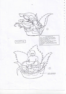
This first image shows how the plant pot can be put onto a table and guided by one of the actors hand to make it move, in some of the scenes, we needed to make two of the plants as there was a hand puppet one and a big one where one of the actors had to stand inside it and move in order for it to look like it was talking and moving.


This second image shows the measurements and how the plant prop could be lifted as a hand puppet and used, it also shows how the hand of the person could grab onto the whole inside of the plants mouth, to make it easier to handle.  


The third image gave us an idea on how to make the big plant more affective, as we needed to figure out how to make it fit onto someone standing, instead of sitting down, as in the instructions it was showing how to make it for someone sitting down. This gave us ideas of having the person stand on a chair and wear the head peace of the plant first, and instead of making a full costume, they would have a piece of green fabric for the stem, with the chair covered by a plant pot.


The fourth image helped us understand how big the head had to be, insuring that it wasn’t too small to allow the person wearing it to breathe. We figured out that by drawing around one of the members of the group and cutting it out, we could visualise how big the headpiece would have to be. 


After looking at all of the images we decided how big the headpiece was going to be, we had already made the hand prop of the plant giving the actor/actress enough hand space to guide the plant around. We also started to make the bigger plant pot to cover the chair that the person holding the plant was going to be on. These instructions had helped us a lot, giving us ideas on how to design the plant and how big it had to be. 


Publishing The Event

In order to make our posters for the event successful, we had to research different posters and analyse them, looking at main colours and fonts used in the posters, this was important as we needed to gain an understanding on what colours would be suitable for a horror and comical production.


Here are some of the posters I decided to look at, when researching connotation, denotation and colours of posters. 


Poster 1-


Connotation-
The poster also portrays another image of the production as the girls on the bottom of the plant, sitting on the car look as if they have something to do with the plant being aggressive toward the characters that it is holding.


Denotation-
The poster shows an image of the main characters of the production, being held up by the plant, it also shows the plant looking aggressive with its mouth open ready to eat one of the characters, this gives the main audience an idea on what the production is all about.


Colours-
The main colours used in the poster are- green, red, black, yellow and blue.
Red is usually seen as the colour to represent blood, yellow and green are used to link to the colour of the plant.
The colour black is mainly used to make the setting look darker and bleaker as it is a horror, so you are most likely to use darker colours other than light.


Typeface/Font-
The title is written using three different typefaces, ‘Little Shop’ is written I a thick block like form, not giving away too much of the story from it, the word ‘Horrors’ does give away a few clues on what the production is about, as it is red and has blood drops falling from it.
Information about the production is written in small print on the bottom of the poster, as the image and title want to be the main items shown on the poster. 


Poster 2-


Colours-
The main colours used in this poster are- brown, green, and red.
These colours all link to the colour of the plant, showing blood and leaves of the blood.


Typeface/Font-
The main typeface used for the title is red and shows blood drops, this also allows the audience that it is a horror, information on the play is given on the bottom right hand corner of the poster, in small print. 

Connotation-
The poster gives of many ideas as the rat running out of the shop door could mean that it has seen something so horrific inside that it got scared and ran away, or it could mean that it has been feeding on the rotting corpses inside the shop.


Denotation-
The poster shows a very well lit shop window, with the plant looking quite aggressive and ready to eat one of the characters, it also shows the shop door half open, with a body’s feet being dragged by the plants stems and a rat running out of the shop, giving us an idea that the plant eats humans. 


Poster 3-


Denotation-
The poster shows an image of the plant facing a woman on the floor, looking in distress, as if it is going to eat her.


Typeface/Font
The fonts used for the title are very similar to the first two posters I have compared, showing blood and using the colours red and yellow, however information about the production is on the left hand corner of the page where the audience can read it clearly, it also has more information written on the left hand side and right hand side of the poster, also allowing the audience to read it.


Connotation-
The image could be showing the plant bending down towards the woman in the poster to help her, as she may have fallen on the road.
As she has her hand on her head showing her to be in distress, looking at the plant in order to help her up from falling.

Colours-
In this poster, the main colours used are- purple, blue, green, red and black.
These colours are also very bright as the poster looks as if a more computerised look is used.


After researching all the posters and learning about what colors would go with each theme, we decided to make a draft poster in order to see whether we would need to make further changes in order to have something very professional to capture the audience’s eye, we then realized that as the audience was mainly the school students, teachers and parents, we had to add more brighter colors and show clearer images giving the audience an idea of what the production was about.


Image of the draft poster


After editing the poster we added more of the colors, corresponding to the plant and blood, using green, red and black as it represented the scary theme of the production, we added an image of the plant, and put it in almost a spotlight of red as it is one of the main characters in the production. Looking at different fonts that could be used, we chose to use a simple small print for other information at the bottom of the page, for the title we used the color red, and made it look like blood drips around the plant. I think that the poster we produced was very affective, as it offered more information, was clearer and easier to read and it also had a clear image of the plant. Not giving too much away. 


After all the planning and changes i had come up with another image of the plants mouth open, at the front of the poster showing that it may want to eat someone or something. I liked this final idea of the poster as it was very affective in the idea that it would not give too much of the story, yet it had one of the main characters on the front of the page. Placing the venue, date and time of the production is crucial as it allows viewers who are wanting to watch the show to know where it is being held and what time and date.


Image Of The Final Poster


This is an image of the final idea of the "Little Shop Of Horrors" poster, after moving around images, researching backgrounds, images, typefaces the group had decided to create this poster for the final piece. This final idea was used and put up around the school, one week before the production had started, this was to gain all the publicity we could. The target audience was mainly the school students so I thought using bright colours against a plain and darker background would be more affective and eye catching to the younger students. 


Interview With The Professional Practice Designer

We interviewed a professional production designer, who had been working in theatre, film and television since 1996. These are a few of the questions we asked her, about her job.


What got you into production design?

-I fell in love with the theatre when I saw my first pantomime; I also realized that I had a natural ability for art, so it made sense to become a theatre designer.

What Problems did you encounter?
-It is a highly competitive industry; you have to be very ambitious and skilled in order to be successful. You work on a self employed freelance basis. You are always responsible for generating your own work. You also have to be disciplined about your cash flow.

What qualifications do you need for the job?
-Art and design is a main part and it helps to be interested in history, you also have to be strong in the area of 3D design, I had a bachelor’s degree in theatre design and a Masters Degree in film and television design. This was six years of qualifications.
   How much do you get paid?
-The pay is very good in film and television, especially commercial work. A designer can get anything over £500 or £600 a day, as the job is freelance, you only get paid for the days you work, therefore you have it’s a balance payment.

-You have to do a lot of networking, and you have an agent who will help you find work, they get a percentage of your income. You always have to make sure that you network with people in the industry.

What are the Pros and Cons of being a Designer?
-The Pros of being a designer are that it is an extremely varied job, and you are always doing something different and creative, the pay is also very good, especially when you are head of the department. Having this job also means you will be travelling a lot.


-The Cons of being a designer are that the job sometimes gets very challenging as there are many challenges to face, there are also very high levels of responsibility such as having to deal with tight budgets and deadlines which sometimes lead to stress, sometimes there is a sense of job insecurity and the job is so demanding as shooting on a film could be 24/7 which means it can take over family life.


What is it like to show your work to an audience?

- It is very exciting especially when you sit in the audience and their reactions are very positive, you realize that you have a significant impact on how much the audience enjoys and understands the performance.

Have you ever had a bad review?
-Yes, once it was down to a technical issue about the sightlines I used in the performance, it is important you make sure that the audience can see the stage.

What Do You Think is the most valuable skill?
-You have to be able to communicate visual ideas to people.
 How did you deal with stress of looking for work?

-You have to do a lot of networking, and you have an agent who will help you find work, they get a percentage of your income. You always have to make sure that you network with people in the industry.

What is it like to show your work to an audience?
-It is very exciting especially when you sit in the audience and their reactions are very positive, you realize that you have a significant impact on how much the audience enjoys and understands the performance.


The Actual Production- Helping Out Backstage


Whilst working backstage on the production, I wrote a few diary entries, explaining everything I had to do when I was working as a part of the backstage crew.  


Day1- 8th March 2010

On day one me and my group helped take down the props that we made, and put them into the hall ready for the production, we were very happy with the end results of the props as they looked very professional, and realistic.

Day2- 9th March 2010

On day two I helped backstage, helping people with their costumes and putting their mics on, I also helped put props onto the set and open and shut the curtains. On both of the days, the backstage crew had to wear black clothing, as on stage blackouts when props were being put out, we were not supposed to be seen by the audience to make it as professional as possible.

Day3- 10th March 2010

On day three I also helped backstage, holding torches on stage blackouts, ensuring that nobody fell or collided into each other. I helped put props out onto the stage again, making sure I was fast and put the props down in the right place as there was only a few seconds to go out and put the props onto the stage. 

Wednesday 5 January 2011

Musical Research

These are some examples of research i have performed looking at the different types of staging used in each musical production.


Les Miserable’s-


Les Miserable’s is always shown on big theatres such as The West End and The Royal Opera House Theatre, above are some images I have found from the production they had put on in London. 

Cats-


Cats is usually shown on big stages, mainly in The West End and so on, this is because the actors and actresses need space to dance and move about freely.


The Little Shop Of Horrors-


Stages used for The Little Shop of Horrors are very small as it not usually shown in theatres such as The West End and The Royal Opera House Theatre.


Stage Designs


Whilst researching stage creations for the production, I started to look images of shops, bridges and flowers set in 1950's New York and images of flower shops in order to cut them out and mount them onto cardboard, this was to help visualize what the backdrop could look like when we painted the scenes on or printed out larger images and stuck them on. I then started to place them in a mini model of the stage and photographed each design to make my visualization very clear and life like.


This first image shows the Brooklyn Bridge with a few cars and trees, I mainly researched my images basing them on Brooklyn as the story is set n Brooklyn. I also looked at images of shops based in a corner, and the shop names, I realised that mostly all shop names were written in neon lighting.


This second image shows steps of the back of an old shop or apartment in Brooklyn, I placed them in the mini stage as I wanted to see whether it would be convenient using it as a part of the backdrop on the production, I didn’t like the end result in the mini stage, so I didn’t put it in as an idea for the production, yet it was just an experiment and I found it helpful giving me ideas for different images that I could use. 


This third image shows The Brooklyn Bridge, shop signs written in neon lights and a plant shop counter with an old flowers display on the bottom of it. I also used an image of a wall that was worn down, with ripped wall paper, I put all of these together as I wanted to see what it would look like when in one of the scenes the shop and surroundings are worn down. 


This is another angle I took the picture of the third one, as I wanted to know what it would look like from every angle of the audience. 


This fourth image shows dustbin cans, and old boxes used for storage, I also used an image of a brick wall, this was to experiment how light the paint should be when painting the bricks on the backdrop, as there was a gloomy scene and scenes where the shop is light, band healthy, I had to take that into consideration. 


The is an image of the measurement practice we did in order to know how to measure where the props would be on stage. I found drawing everything out with the accurate measurements very helpful, as it helped me picture the stage and what it would look like with the life size props, instead of imagining what it would look like on the day.


Audience

We attracted the audience by creating our own posters; the audience was varied from students, parents, and teachers, younger and older siblings. The audience feedback was very good, here are some of the comments they gave us:

–      “The show was amazing! Really lively and colourful.” (Anisha 14 yrs)
–      “The big plant was scary; did it really eat that man?” (George 5 yrs)
–      “It was very professional looking for a student production. The lighting and sets made it look very convincing”  Mrs. Bansal (Mum 39)
–      “The props and background were impressive, especially the giant plant and how it got bigger and bigger in each scene, that was the best bit. It really looked like it was eating people” Mr. Edwards ( Teacher 59)
–      “ There were some scary parts and the songs were very good” (Faizan 16 yrs)
–      “I wish I had known it was gonna be that good, I would have auditioned for a part. It felt like a professional musical” Amrit 13 yrs

As I was working backstage on both of the nights of the production I thought that it would be very successful as the actors and teachers and props looked very professional. All the teachers in charge of the production were very pleased with the outcome of it and were also very happy with the audience feedback.

Tuesday 4 January 2011

Meeting With Miss Jones- Client

The client was Miss Jones as she was the one in charge of the production taking place, the first thing we presented was our flower designs for props and brick designs for the backdrop of the stage. She said that “The set needs to be a dry, humid, street, with a shabby layout. We then re-thought our designs and made the flowers more colorful, and made the backdrop painting more spooky using dull colours, in order for it to represent the settings used in the film. The outcome of the scene was very realistic as the props and backdrop looked similar to the ones used in the film.


Importance Of Relationship With The Client


It is important to be able to communicate well with your client as following all of their ideas and expectations would make the job a lot more easier, as they are professional and know how everything should look. As my client was the director of the production, her visions of what the show should look like properly. Showing my ideas and models, and images were very crucial as I was able to gain an idea of what I should be changing and improving on, in order to make my work look much better.